Website Redesign for Marketing Agency ClearPivot
Role: UI/UX and Visual Design
The Challenge:
ClearPivot, a Denver marketing firm, tasked us with creating a website which would showcase their demand generation and hubspot operation services to marketing directors of B2B SaaS companies, B2B consulting firms, and from other select industries, and convert them into clients.
The Solution
Laura carried out the following steps to create a new website that accomplished these results and reflected their updated brand:
Goal Identification, Audit of Current Site, Iterations of Sitemap + Wireframe Creation, Brand Refresh, UI, Visual Design, Launch, and Iterations


Goal Identification and Audit of the Existing Site
Laura helped ClearPivot identify the goals for each section of their site and presented ClearPivot with a plan for clarifying the messaging of each homepage section and corresponding CTA’s, simplifying the site navigation, replanning the sitemap according to their SEO requirements, and proposing updates to the visual design.
Build New Sitemap
Laura carried out rounds of iterations on revising a new, more simplified sitemap to make content more easily accessible. She and stakeholders at ClearPivot carried out rounds of iterations. Pictured is one of her early sitemap proposals.
Wireframes
Laura created wireframes with basic outlines of content and ui elements.
Brand Refresh
The old ClearPivot visual brand featured overly muted and dark colors, heavy typography, and cramped, disproportionate logo. Laura redesigned the brand elements by visually lightening the colors, typography, and logo to reflect the agility and ease of the company’s core metaphor: the pivot.
Logo Refresh
It was important to the client to retain the arrow mark on the P, so Laura replaced the cramped, disproportionate letterforms of the wordmark with more legible, modern typography that still retained the tidy curves of the previous version.

Typography Refresh
To relieve the serious tone of the previous heavy font choices, she created a type system that utilized a condensed typeface with more personality and elegance, balanced by simple sans-serifs.
Color Refresh
Since ClearPivot wanted to keep the original dark and medium blues, Laura made them more contemporary by slightly increasing saturation. She reflected the energy and speed of ClearPivot’s services in a new secondary color palette of brighter, more saturated hues, balanced by generous use of white space.

Visual Design
Now that the visual identity had a new spring in its step, Laura carried out the visual design in desktop for all pages and interactive elements.
Visual Design for Mobile
Once the desktop versions had been approved, Laura designed all the pages for mobile.
Beta Review, Design Population Edits, and Launch
Laura reviewed the beta site and gave the developer rounds of edits to ensure the site would accurately reflect the design and be ready for the launch.
Special Features Laura Designed
A closer look at my favorite extra features Laura designed to give dimension and personality to the site.
Custom Icon Set
In a sea of marketing companies, small touches like a custom family of icons set a website apart. Laura created these to elevate the design and the results were an elevated list of services offered that the user can quickly scan, and a sense of playfulness and energy to draw their eye.
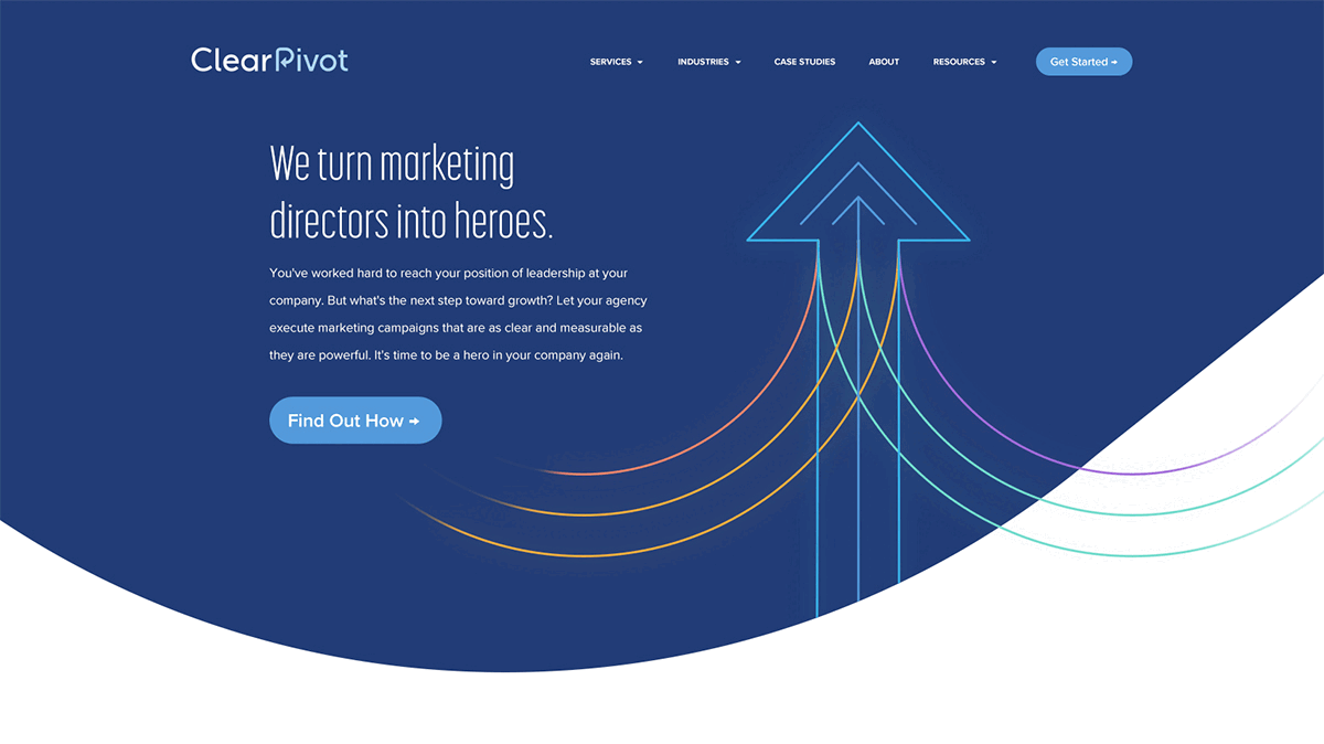
Logo-inspired Hero Illustration
ClearPivot wanted to maintain the visual pivot metaphor of the arrow in the P of their logotype, by having it depicted in the homepage hero. Laura created an illustration that further reiterated their P logomark by turning it on its side to base the arrow illustration on. The arrow also points users’ attention upward towards the “Get Started” CTA in the navigation.
Custom Podcast Page Header Background Artwork
ClearPivot specifically requested custom header artwork that brought dynamism to the podcast feed page. They loved the artwork Laura created that not only brought a sense of action through halftones and radial lines, but also maintained legibility behind text and took the brand colors for a new spin.

Design Awards
Laura’s new design for this site was selected to be featured in The Best Business & Corporate Web Designs by DesignRush. View Feature Here.